
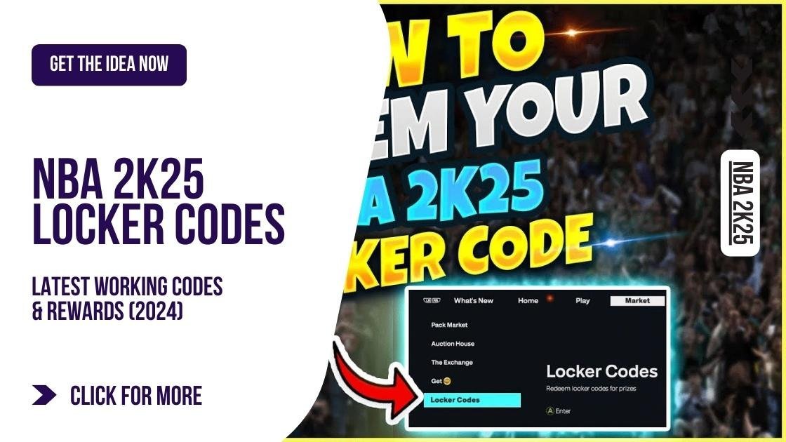
The NBA 2K25 user interface analysis reveals a largely iterative design, with minor adjustments to menus and in-game displays, focusing on improved navigation and quicker access to key features.
The court is calling, but before you lace up those virtual sneakers, let’s talk about what you’ll actually be seeing. This article dives deep into the NBA 2K25 user interface analysis. We’re not just discussing aesthetics; we are examining how the game’s menus and on-screen displays impact your overall experience.
From navigating MyCareer to tweaking your team’s strategy, the UI is crucial to enjoying the game. Is it easier to use compared to previous versions? We’ll break down all the changes and highlight any improvements (or setbacks) that await players.

NBA 2K25 User Interface Analysis
Alright, basketball fans! Let’s dive deep into the world of NBA 2K25 and talk about something super important – the user interface, or UI. Think of the UI as the control panel of the game. It’s everything you see on screen, from the menus to the way you navigate during a game. A good UI makes playing the game easy and fun, while a bad one can make you feel confused and frustrated. So, how does NBA 2K25 stack up? We’re going to explore all the details, pointing out what works well, what could be better, and how it all affects your gameplay.
The Main Menu Experience
The first thing you see when you start NBA 2K25 is the main menu. It’s like the front door to the entire game. A good main menu should be simple, easy to understand, and give you quick access to everything you want to do. Let’s look at different aspects of the main menu.
Layout and Navigation
NBA 2K25 usually presents a menu with large icons or tiles. These icons represent different game modes, like MyCAREER, MyTEAM, Play Now, and others. The key here is how easy it is to move between these options. Is it intuitive? Can you quickly go from MyCAREER to Play Now without getting lost? The menu also features a scrolling system, often horizontal, that enables you to browse different game modes. This is a common design, but how well it’s implemented is key. The menu should be responsive and smooth, without any lag or delays. Also, it should use good visual cues to show which option is currently selected.
Visual Clarity
Visual clarity is vital in a main menu. The colors should be easy on the eyes, and the text must be readable. No one wants to squint or strain their eyes just to read a game option. NBA 2K25 usually employs a dark background with bright, contrasting text. This helps readability. The use of images and logos for each mode is also a smart move, as these images should instantly tell the player what to expect in that mode. But too many flashy effects or animations can sometimes be distracting. A good balance is key.
Loading Times
One of the most annoying things can be a menu that takes forever to load. The main menu should load quickly and smoothly. If you find yourself staring at a loading screen for too long every time you go back to the menu, that’s definitely a problem. Ideally, the game should load the menu in a matter of seconds, so you can quickly jump back into the action.
In-Game HUD (Heads-Up Display)
Once you’re actually in a game, you’re interacting with the in-game Heads-Up Display, or HUD. This is the information that appears on the screen while you’re playing, like the score, the timer, player names, and other vital details. This information helps you stay on top of the situation, without obstructing your view. Let’s check out what makes up a good in-game HUD.
Key Information Display
The HUD needs to show essential information clearly and concisely. The score should always be visible, as well as the game clock. It should also display the possession arrow, timeouts remaining, and sometimes, the players on the court. The way the information is displayed is important. The score, for example, is usually shown with bold, clear numbers. Player names should be shown clearly without blocking too much of your view. The HUD needs to be helpful without being too overwhelming.
Placement and Size
Where information is placed on the screen matters a lot. The score is usually at the top, either centered or on the sides. Crucially, this placement shouldn’t be in a spot that obstructs your view of the action on the court. The size of the text and numbers is also critical. They should be big enough to read easily but small enough not to be distracting. If the elements are too big, they can block your view of the court. If they are too small, you might struggle to read them quickly. It’s all about balance.
Contextual Information
Sometimes, the HUD needs to provide extra information based on what’s happening in the game. For example, when a player is tired, there might be a symbol indicating their fatigue. Or, if a player is on a hot streak, a flame or fire symbol may be shown beside them. This type of contextual info helps you to make better decisions in the game and strategize your next moves. This type of on-the-fly data is vital for a competitive edge.
Player Control and Feedback
The way you control your player and how the game gives you feedback is very closely related to the UI. This includes things like the shooting meter, dribbling controls, passing assistance, and general responsiveness. Let’s delve into how NBA 2K25 handles this.
Shooting Meter
The shooting meter is a big part of how you play basketball in NBA 2K25. The meter is usually a bar that fills up as you hold the shoot button. The goal is to release the button at the correct time to get a good shot. The visual feedback from the meter has to be clear and precise. You need to know when you’ve released the shot at the right point, and understand what’s causing shots to go in or miss. A shooting meter that feels confusing or inconsistent is a major problem.
Dribbling Controls and Inputs
Dribbling is a complex part of the game and good controls are essential. The game should provide feedback on your dribbling inputs, helping you learn the controls and make new moves. It must be easy to switch between different dribbling styles by showing what button combinations to use. The game should clearly show when a player has performed a move correctly. The controls must feel intuitive and responsive. If you press a button to crossover, the player should immediately make that move on screen. Any kind of delay or lag in responsiveness can ruin the gameplay experience.
Passing Assistance
Passing is very important in the game. NBA 2K25 usually gives a little help with passing. The game provides a target system, which helps you aim your pass at the right player, with icons showing who to target. The game usually has different levels of passing assistance, allowing you to choose how much help you get. Good assistance makes it easier to make accurate passes. You want the game to provide enough assistance to help you play, without making the game too easy.
Menus within Game Modes
Each game mode within NBA 2K25 (MyCAREER, MyTEAM, etc.) usually has its own set of menus. These menus need to be well-designed and easy to use so that each game mode feels enjoyable. Let’s explore what makes these menus good or bad.
MyCAREER Interface
MyCAREER is all about your created player and their career. The interface for this mode should be easy to navigate, showing your player’s stats, progress, and upcoming games. It also needs to allow you to manage your player’s skills, badges, endorsements and sponsorships, and even your personal appearance. The MyCAREER menu is complex because it has to handle a large variety of functions. It must be easy to find and modify all of these player-related items.
MyTEAM Interface
MyTEAM is the card-collecting and team-building mode. The interface here should let you easily manage your cards, view your team roster, and access game modes like challenges and online play. The way you open new packs and manage different types of cards should also feel smooth. The menus must clearly show you the stats of your cards, their abilities, and any special features they might have.
Play Now Interface
Play Now usually has the most straightforward interface, where you choose teams and jump into a quick game. The menu should quickly allow you to select your team, opponents, and settings. You need to easily select between offline and online game modes and view all your selected teams. It must also let you easily select different types of teams, like classic teams or All-Star teams.
Customization Options
Many players love to customize the game, whether it’s by changing how your player looks or tweaking the gameplay settings. How does NBA 2K25 handle this? Here’s what’s important:
Player Customization Menu
The player customization menu is where you change your player’s appearance. It must be easy to select from a wide variety of options, such as hairstyles, clothes, tattoos, and accessories. It should allow you to easily preview your changes in real-time so you know how things will look before confirming them. The process of creating and customizing a player should be fun and engaging, and not feel like a chore.
Controller Settings Menu
Many players love to change their controller settings. A good menu should allow you to remap buttons, adjust sensitivity, and switch between different control styles (like classic or modern controls). All of these changes should be easy to perform, and the game should provide feedback on your new setup. You should also be able to create several custom control profiles to save different setups.
Visual Settings Menu
Visual customization is also important. The game should allow you to adjust graphic settings to suit your hardware. This allows the game to run smooth and look good on all types of machines. The menu should provide all the graphics options and explanations for each one. It should also show the performance impact of different settings so that you can make informed decisions.
Accessibility Features
A great game should be accessible to everyone, no matter their limitations. NBA 2K25 needs to provide accessibility features to allow everyone to enjoy the game. Let’s look at some important features.
Text Size and Contrast Options
The game should allow you to adjust text size and contrast, which can help people with visual impairments. If the text is too small or doesn’t have enough contrast against the background, it might be hard to read. Providing options for different text sizes and colors ensures everyone can read the UI easily.
Subtitle Options
Subtitles are a very important tool for deaf or hard-of-hearing people, and also for players who prefer to play with the sound off. The game should provide clear and accurate subtitles for all in-game dialogue. The size, colors, and background of the subtitles should also be adjustable. Subtitles should be visible without interfering with the player’s experience.
Colorblind Modes
NBA 2K25 should provide colorblind modes for people with color vision deficiency. These modes tweak the color scheme to make the game easier to see. Players should also be able to test different types of colorblind options to help find the right one.
Areas for Potential Improvement
While NBA 2K25 usually does a good job, there are always areas that could be improved. Here are a few things that might help make the user interface even better.
Menu Clutter
Sometimes, the menus can feel a little crowded. Too many icons, too many submenus, or too much text can make it hard to find what you are looking for. Simplifying the menus and making them more organized would really improve the experience.
Inconsistent Design
In some places, the design style of menus is different than other parts of the game. This lack of consistency can sometimes be confusing, making the overall experience seem less smooth. Having a uniform design throughout the game is essential.
Loading Times
While loading times are better than in some older games, certain parts of the game still take too long to load. This can make the player feel like the game is sluggish. Reducing loading times would make the game experience more enjoyable.
Tutorials and Explanations
Some parts of the game, particularly the more complex modes, are not fully explained. Improving the in-game tutorials and providing clear instructions for different controls would help new players get into the game easier.
In conclusion, a well-designed UI makes a significant difference in the overall enjoyment of any game, and NBA 2K25 is no exception. While it has made some strides in past iterations, there’s always room for refinement. By paying attention to elements like layout, visual clarity, responsiveness, and accessibility, the developers can create an even more user-friendly and engaging basketball experience.
NBA 2K25 Review
Final Thoughts
In short, the NBA 2K25 user interface appears to prioritize visual clarity with a more intuitive layout than previous installments. The menus feel quicker to navigate. Players should find accessing features a much smoother experience.
However, some may criticize the updated design for being a bit too minimalist. Still, the overall impression from our NBA 2K25 user interface analysis suggests the developers are focusing on better user experience. We believe this change will benefit the player.

