
Understanding Roblox color theory for designers involves using color palettes effectively to evoke specific moods and guide players through game environments.
Have you ever wondered why some Roblox games feel so captivating, while others seem bland? A crucial element often overlooked is color. It’s not just about picking pretty shades; understanding Roblox color theory for designers is a powerful skill that can greatly improve your game’s appeal.
Effective color choices can guide a player’s eye, create atmosphere, and even influence gameplay. Knowing how colors interact allows designers to build more immersive and enjoyable experiences for everyone.

Roblox Color Theory for Designers
Okay, fellow Roblox creators! Let’s dive into the super exciting world of color. You know how colors can make you feel happy, sad, or even hungry? Well, the same is true when you’re designing awesome experiences in Roblox. Using colors the right way can make your games and creations look amazing and grab players’ attention, and that’s where color theory comes into play. Don’t worry, it’s not as complicated as it sounds. We’ll break it down into easy-to-understand pieces, so you can start creating even better Roblox projects!
Understanding the Basics of Color
Before we jump into specific Roblox applications, let’s quickly cover some basic color concepts. Think of it like learning the alphabet before writing a story. These building blocks are important, no matter what kind of art you are creating – even in Roblox!
Primary, Secondary, and Tertiary Colors
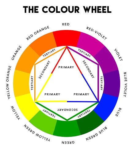
Imagine you have three main colors: red, yellow, and blue. These are called primary colors. You can’t make them by mixing other colors. Then, when you mix two primary colors together, you get secondary colors. Red and yellow make orange, yellow and blue make green, and blue and red make purple. Easy, right? Now, when you mix a primary and a secondary color, you get a tertiary color! These are colors like red-orange, yellow-green, and blue-violet. The combination of primary, secondary and tertiary colors creates the color wheel, a tool that will help you visualize color relationships.
The Color Wheel
The color wheel isn’t just a pretty picture. It’s a map that shows how colors relate to each other. Imagine it as a giant circle with all of the colors arranged in a specific order. This order isn’t random! It’s based on how colors mix together. The color wheel allows us to easily understand how colors interact and helps us make smarter design choices. You’ll see later how to use the color wheel to create color schemes.
Understanding Hue, Saturation, and Value
Think of a specific color, say a bright red. That “red-ness” is the hue. It’s just the base color itself. Now, imagine turning down the brightness of that red. How vibrant it appears is called saturation. A highly saturated red is very bright and intense, while a low saturated red is more muted and grayed. Finally, consider how light or dark that red is. That’s its value. A high value makes it a light red, almost pink, and a low value makes it a deep, dark red. These three attributes (hue, saturation, and value) are the three ways we describe and manipulate color!
Let’s put this into a simple table:
| Attribute | Description | Example |
|---|---|---|
| Hue | The base color (e.g., red, blue, green) | Red is a hue. |
| Saturation | How intense or muted the color is. | A bright red has high saturation; a dull gray has low saturation. |
| Value | How light or dark the color is. | A light pink has a high value; a deep maroon has a low value. |
Color Psychology in Roblox
Colors are not just visually appealing; they also have the power to influence our moods and feelings. That’s called color psychology, and it’s super useful for game designers. In Roblox, you can use color psychology to make players feel happy, scared, excited, or whatever emotion you want them to have while playing your game. It’s almost like magic, but it’s actually science!
Common Color Associations
- Red: Red is often associated with energy, excitement, danger, and passion. In Roblox, you might use red for lava, fire, or as a warning signal.
- Blue: Blue is linked to calmness, peace, trust, and intelligence. You might use blue for water, the sky, or for user interfaces.
- Yellow: Yellow is associated with happiness, joy, optimism, and caution. You can use yellow for bright sunny skies or to signify something important.
- Green: Green often represents nature, growth, health, and wealth. Use green for grassy areas, forests, or for healing power-ups.
- Orange: Orange symbolizes creativity, enthusiasm, and warmth. Consider using orange for things like sunsets, desert areas, or as a highlight color.
- Purple: Purple often conveys royalty, luxury, wisdom, and mystery. You could use purple for fantasy areas, magical items, or for a sophisticated feel.
- Black: Black represents power, elegance, mystery, and sometimes evil. Use black in moderation, like for night scenes or in dramatic moments.
- White: White often represents cleanliness, innocence, and peace. You might use white for snow, hospitals, or a pure and simple design.
These are not hard and fast rules. The cultural and individual experiences can influence color perception. However, these are common associations that can be leveraged.
How to Use Color Psychology in Your Roblox Games
Think about the type of mood you want to create for your players. Do you want them to feel excited? Then use colors like red, orange, and yellow. If you want them to feel relaxed, use blues, greens, and softer shades. Think about how the colors make you feel. If you feel excited when you see red, there is a good chance that others will too!
Consider these scenarios:
- In a horror game, use dark colors like black and gray, with splashes of red to create a creepy feeling.
- In an adventure game, use a variety of colors to make the world feel alive and exciting, like blue for the sky and green for grassy areas.
- In a puzzle game, use contrasting colors to make the puzzles easier to see and understand.
- In a social game, use bright and welcoming colors to create a friendly environment, like yellow and pink.
Creating Color Schemes
A color scheme is a group of colors that work well together. It’s like picking the right outfit, certain colors look better together than others. In Roblox, a well-planned color scheme can make your game look much more polished and professional. Don’t worry, we’ll explore the most common ones!
Monochromatic Schemes
A monochromatic color scheme uses different shades, tints, and tones of just one color. Imagine having all the same blues but with a variation of the lightness and darkness. It’s a very simple scheme to work with and gives a clean and cohesive look. Think of a snowy mountain range. It might have a monochromatic scheme of blues and grays, from dark to light. In Roblox, you could use monochromatic schemes for specific areas, like a temple that is designed in different shades of the same color, like a specific shade of green.
Analogous Schemes
An analogous color scheme uses colors that are next to each other on the color wheel. It’s like picking colors that are neighbors. For example, you could use blue, blue-green, and green. Analogous schemes are very harmonious and pleasing to the eye. Think of a beautiful sunset, which often incorporates yellow, orange, and red colors that are right beside each other on the color wheel. In Roblox, you might use analogous colors in a forest setting with blues, greens, and yellows.
Complementary Schemes
Complementary colors are colors that are directly opposite each other on the color wheel. Examples are red and green, blue and orange, or yellow and purple. These colors create high contrast and are very visually stimulating. They can be really effective when you want something to stand out or to draw a player’s attention to something. Imagine a red stop sign against a green background; that’s a complementary scheme. In Roblox, a complementary color scheme might be used to highlight specific interactable objects in a world, like a blue button against an orange wall.
Triadic Schemes
A triadic color scheme uses three colors that are evenly spaced on the color wheel. Think of these colors as making a perfect triangle on the color wheel. An example would be red, yellow, and blue, or green, orange and purple. Triadic schemes are very vibrant and balanced. They are perfect for creating a playful and energetic environment. For example, a carnival scene or vibrant, fantasy environments can utilize this scheme. In Roblox you could use triadic colors for fantasy themed areas or lively game maps.
Tetradic Schemes
Tetradic, sometimes called rectangular, schemes use four colors arranged into two pairs of complementary colors. Imagine two sets of complements next to each other. For example you could combine red, green, blue and orange, or a combination of yellows, purples, blue-greens, and red-oranges. These schemes are dynamic and have a rich palette, but need extra consideration to make sure the colors are balanced and don’t clash. It’s important to have a main color in this scheme and then use others as accents. In Roblox, you might use tetradic schemes for a complex game environments, such as a busy city scene or a dynamic marketplace.
Tips for Choosing Your Color Scheme
- Start with a main color: Pick one color that is the most important for your game. It will help guide you in picking the rest of the colors.
- Limit your palette: Try not to use too many colors at once. It can make your game look messy. Two to four colors are usually enough for most Roblox games.
- Test your colors: Before you add a bunch of colors, test how they look in your game in Roblox. Not all colors translate well to a digital platform, so testing will save you time.
- Consider your audience: Different color schemes can appeal to different audiences, for instance, muted colors can often appeal to older players.
- Use online tools: There are many free color palette generators that can help you find color combinations that work well together.
Applying Color Theory to Roblox Assets
Now, let’s put this all together and look at how you can use color theory when designing in Roblox! This is where the fun really begins! We’ll go through the major kinds of assets you might design and how to consider color for each one.
User Interfaces (UIs)
UIs are the menus and buttons that players use to navigate your game. For UIs, it’s really important to use color to create good visibility and easy to understand interface. Use contrasting colors to make text easy to read. For example, use white text on a dark background or black text on a light background. Use colors to indicate different types of buttons, like using green for “start” or red for “cancel.” Avoid using overly saturated colors in UIs. They can strain the eyes and make it harder to read. Keep the colors consistent throughout all your UIs, so the user knows what to expect in your game.
- Use Contrast: Ensure sufficient contrast between text and background elements.
- Color Coding: Employ colors to signify different functions (e.g., green for accept, red for cancel).
- Consistency: Maintain a consistent color scheme throughout the interface.
- Avoid Harsh Saturated Colors: Use toned down, desaturated colors for comfortable viewing.
Characters
Color is crucial to make characters stand out and convey their personalities. If you’re creating a hero, you might use bright, bold colors like blues and reds. If you’re making a villain, consider using darker colors like blacks and purples. Make sure the character’s colors also fit the setting of the game. If they’re in a snowy area, for instance, they should use colors that complement a wintery world. You can use different colors for different parts of the character. For example, a warrior might have armor in a metallic gray or silver and a cape in a bright color.
- Character Identity: Use colors to represent a character’s role, good or evil.
- Contextual Relevance: Align character color schemes with the environment or setting.
- Color Separation: Distinguish character parts using different complementary or analogous colors.
Environments
Color can totally set the mood of a game environment. If you want to create a spooky atmosphere, use dark and muted colors like grays and blacks. If you’re making a cheerful, sunny place, use bright yellows, blues, and greens. Use analogous or monochromatic schemes for environments that are meant to be calming. Use complementary or triadic schemes for environments that need to feel exciting and engaging. Think about how the lighting affects the colors. A bright sunny day will make the colors look different than a dark and stormy night.
- Set the Mood: Use color to define the atmosphere of the environment, such as dark colors for spooky and bright colors for joyful.
- Color Scheme Strategy: Apply appropriate color schemes (analogous for calming, complementary for engaging).
- Lighting Awareness: Consider how lighting interacts with the color choices.
Objects and Items
Colors can be used to make certain objects stand out as important. For example, use bright colors for items that the player needs to pick up, like yellow for gold or red for a health potion. You can use colors to show the rarity or value of the items. For example, use silver for common items, gold for rare items, and purple or other rich colors for legendary items. Choose colors that match the material of the item. For example, wood might be brown, metal might be gray, and water might be blue.
- Highlight Important Items: Use bright, attention-grabbing colors for important items or interactables.
- Value Differentiation: Use colors to indicate the value of items, such as silver, gold, and purple for rarity.
- Material Representation: Match colors to the material of the object (e.g., brown for wood).
Advanced Color Tips for Roblox Designers
Once you have the basic color concepts down, you can begin to think about how to push your designs further! This section helps you go from color novice to color expert in no time.
Using Color to Create Depth
Colors can trick the eye and create the illusion of depth. Think of using lighter, softer colors for things that are far away and darker, more saturated colors for things that are close by. It’s called atmospheric perspective. It can really enhance your game. In a scene of rolling hills, you can use lighter blues and greens for hills that are further in the distance. This makes your game look more realistic and immersive. You can also use colors to suggest the relative distance of objects. For example, an object colored with warm colors like red and orange will appear to be closer than an object colored in cool colors like blue and green.
Working with Lighting and Shadows
Lighting in Roblox can completely change how your colors look. When you are choosing colors for your assets, keep in mind where the light is coming from. Make sure to test your color choices with different types of lighting, such as bright sunlight, dim lighting, or artificial light, to make sure that they will look correct in your game. Shadows also influence color, as shadows will generally darken the color in the environment. Use the shadows to your advantage. You can make objects look more 3D by having shadows fall on the ground.
Accessibility and Colorblindness
It is vital that you keep colorblind players in mind! Colorblindness affects many people. Make sure to design your game in such a way that people who have difficulty distinguishing between colors can easily play. Do not use color as the only visual cue. You can also use patterns, shapes, or labels to make it easier for colorblind players to distinguish between things. For example, don’t only rely on red and green to show “go” or “stop.” Use alternative methods like different shapes and text labels. Many free online tools will simulate different forms of colorblindness. Use them to test your designs to ensure accessibility.
Consistency and Branding
If you are making a series of games or want to develop a brand identity for your creations, maintaining a consistent color palette is key. This means using the same colors for your UI, characters, environment, and even marketing materials. This creates a sense of familiarity and helps players recognize your work more easily. Don’t be afraid to experiment but try to develop a cohesive and recognizable palette. By creating a strong brand for yourself, you will increase your chances of players identifying your creations among the plethora of Roblox games.
Color is a powerful tool. By learning how to use color theory, you can create truly spectacular Roblox games and experiences. Remember, practice makes perfect! Start small, experiment with different color combinations, and don’t be afraid to try new things. Happy designing!
Color Theory for Noobs | Beginner Guide
Final Thoughts
Applying roblox color theory for designers significantly impacts player experience. Effective use of hues, saturation, and value creates engaging and navigable game environments. Understanding these principles helps designers evoke specific emotions and guide player attention.
Good color choices can make the game feel more immersive and appealing. By carefully considering color harmonies, designers can improve gameplay clarity. Ultimately, thoughtful use of roblox color theory for designers enhances the overall quality of any Roblox project.

