Roblox UI design principles prioritize clarity, consistency, and intuitive navigation to create user-friendly interfaces within the game environment.
Creating engaging experiences in Roblox requires more than just good gameplay. The user interface is the player’s primary interaction point, and effective Roblox UI design principles are crucial. A well-designed UI guides players effortlessly through menus and game elements. This directly improves the overall player experience and engagement in any Roblox game.
These principles involve ensuring that all buttons and menus are easily understood and placed logically. Think about players’ ease of access and quick learning curve when designing. Consistent visual styles across your game build a reliable and comfortable environment for all.

Roblox UI Design Principles: Creating Engaging Experiences
Creating a great Roblox game is more than just building cool maps and writing fun scripts. The user interface (UI), the stuff you see on the screen like buttons and menus, is super important. It helps players understand what’s going on and how to interact with your game. Good UI design makes your game easier and more fun to play, while bad UI can confuse and frustrate players. Let’s dive into the world of Roblox UI design and see how to make your game shine!
Understanding the Basics: What Makes Good UI?
Think of UI as a guide for your players. It should be clear, simple, and intuitive, meaning players should know what to do without needing instructions. Here are some core principles of good UI:
Clarity: Players should easily understand the purpose of each button or element. No confusing icons or text!
Consistency: Use the same styles and layouts throughout your game. This helps players learn how to use your UI faster.
Simplicity: Keep things as straightforward as possible. Don’t add unnecessary elements or overly complicated designs.
Responsiveness: The UI should react quickly when players interact with it. No annoying lag!
Accessibility: Design your UI so it’s easy for everyone to use, no matter their device or how they play.
The Importance of Visual Hierarchy
Visual hierarchy is all about how you arrange things on the screen to guide the player’s eye. Important things should be bigger, brighter, or placed in a more noticeable location. Here’s how to achieve this:
Size: Larger elements stand out more. Use this for key buttons or messages.
Color: Use contrasting colors to draw attention to important items. Avoid using too many colors that make the UI look busy.
Placement: Place the most important elements in the center or top of the screen, where they are easily visible.
Spacing: Use space around elements to make them easier to see and understand. Avoid cramming everything together.
Font Choice: Choose fonts that are easy to read and consistent throughout your game. Different styles can convey different messages, like using a bold font for important notifications.
Keeping It Simple: Less Is More
Overloading your UI with too many elements can overwhelm players. Simple, clean designs are easier to understand and use. Aim for clarity and avoid unnecessary graphics or text. This includes:
Minimizing Text: Use concise text and descriptive icons rather than long paragraphs.
Avoiding Clutter: Remove any elements that are not absolutely necessary for the user’s experience.
Clear Feedback: When a player interacts with the UI, provide clear and immediate feedback, such as a button changing color when pressed or a sound playing.
Key Elements of Roblox UI Design
Let’s explore some common UI elements you’ll use in your Roblox game and how to design them effectively.
Buttons: The Gateways to Action
Buttons are fundamental in any game. Here’s how to design good buttons:
Clear Labels: Use clear text or icons that tell players what the button does. Avoid confusing or ambiguous labels.
Good Size: Make sure the buttons are large enough for players to easily click on with their mouse or touch screen.
Visual Feedback: Make the buttons change when they are clicked or hovered over, to show the player it is working.
Consistency: Ensure all buttons have the same consistent design. Shape, color and font should match throughout the game.
Placement: Place buttons in locations that are natural and easy to find. For example, a ‘Play’ button should be in a central location on the menu screen.
Text Boxes: Input and Interaction
Text boxes allow players to input information. Here are tips for effective text box design:
Clear Labels: Label text boxes clearly so players know what information they should be entering.
Placeholder Text: Use placeholder text within the text box to provide a hint or example of the expected input.
Limit Input Length: If necessary, limit the number of characters players can enter to avoid errors and long text boxes.
Validation: Add code that checks if the entered input is valid and provides feedback to the user if not.
Accessibility: Ensure text boxes are large enough and easy to see. Use clear and easy to read fonts.
Menus: Navigating Your Game
Menus organize different parts of your game. Effective menu design includes:
Clear Categories: Group menu items into logical categories to make it easy to navigate.
Intuitive Layout: Use a layout that is easy to follow. Consider using tabs or dropdown menus for complex menus.
Consistent Design: Maintain a consistent design for all menus within your game, using the same fonts, colors, and styles.
Clear Navigation: Players should be able to navigate between menus without getting lost or confused.
Avoid Overloading: Don’t put too many items into one menu. Break menus into smaller and more logical sections.
Progress Bars and Loading Screens: Showing Progress
Progress bars and loading screens keep players informed. Here are some helpful ideas:
Clear Progress: Make sure the progress bar accurately shows the loading status or progression of some activity.
Visual Cues: Use visual cues, like a moving bar or a loading animation, to keep players engaged.
Estimated Time: If possible, show players how much time is left, so they know what to expect.
Avoid Over-Animation: Too many animations can slow the game down. Use animations that are smooth and not distracting.
Informative Text: Use text to let players know what the game is doing. Examples: “Loading…” or “Connecting to Server…”
Color and Typography
Color and typography are important factors in creating a good UI. Here’s how to use them effectively:
Color Psychology and Game Design
Colors can greatly influence how players feel. Use colors that match the mood you want to create in your game:
Red: Can signify danger, excitement, or urgency. Use it for warnings, alerts, or important notifications.
Blue: Conveys trust, calmness, and peace. Use it for menus, options or general user interface elements.
Green: Represents growth, health, and progress. Good to use for health bars, status indicators or positive feedback.
Yellow: Can signify caution or happiness. Use yellow for warnings that are less critical than red or for highlighting things.
Neutral Colors: Use black, white, and gray for backgrounds and other less critical elements. It helps other elements stand out.
Choosing the Right Typography
Fonts affect how players read and understand the UI. Here’s what to consider:
Readability: Choose fonts that are easy to read and that are not too complex.
Consistency: Use the same font style across your game to keep it looking professional.
Font Size: Make sure the font size is large enough for players to read on different devices.
Font Color: Choose font colors that contrast well with the background, for easy reading.
Font Style: Use bold or italic fonts sparingly to highlight important text. Avoid using too many styles.
Designing for Different Devices
Roblox is played on many different devices, so it’s important to design your UI to work well on all of them.
Screen Sizes and Resolutions
Screen sizes and resolutions are different on different devices, like phones, tablets, and computers. Here’s how to handle different screen sizes:
Scalable UI: Create UI elements that scale properly across different screens sizes without looking stretched or too small.
Anchoring: Use anchors to position elements relative to the edges of the screen, to ensure that elements always stay in their proper positions.
Padding: Use padding around UI elements to keep things spaced properly on all screen sizes.
Testing: Test your UI on different devices to ensure that it looks good and works well on all of them.
Touchscreen vs. Mouse/Keyboard
Players can interact with UI differently, on touchscreens and with mouse and keyboards. Consider these differences:
Larger Buttons: Touchscreen buttons should be larger so that players can tap them easily with their fingers.
Spacing: Add more space between elements so players with large fingers don’t accidentally tap the wrong thing.
Accessibility: Ensure that your UI can be easily used with both touch and mouse or keyboard.
Responsive Feedback: Make sure that button clicks or taps respond instantly so the player feels engaged and in control.
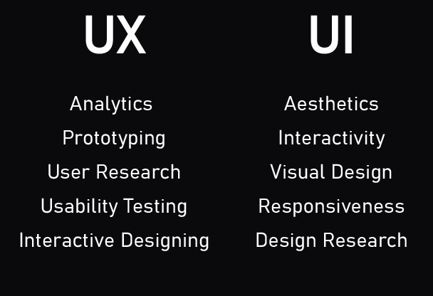
User Experience (UX): Putting Players First
User experience, or UX, is all about making sure that players have a good time when playing your game. It means focusing on players’ needs and making your game easy and enjoyable to use.
Intuitive Navigation
Players should be able to move through your game without any confusion. Here’s how to make navigation intuitive:
Clear Pathways: Guide players from one part of the game to another using clear buttons, menus, and arrows.
No Dead Ends: Ensure there are always options for players to move forward. Never leave them stuck or lost.
Consistent Navigation: Use the same navigation patterns throughout the entire game, so the player doesn’t have to learn new patterns.
Short Paths: Keep navigation paths simple and short. Don’t make players go through too many menus to get to where they want to be.
Visual Cues: Use visual clues, like highlighting selected options or menu icons, to help players navigate smoothly.
Player Feedback and Response
Players need to know when their actions are working. Provide clear feedback for everything a player does:
Visual Feedback: Change colors, move elements, or display animations to show players when they interact with the UI.
Sound Feedback: Play sounds when players click a button or complete an action.
Text Feedback: Display messages that inform players when an action is successful or fails.
Clear Messages: When something goes wrong, display clear and easy to understand error messages to help players fix the issue.
Immediate Responses: Make sure that all the user interface is responsive and gives feedback quickly.
Testing and Iteration
It’s important to test your UI and see if it is working the way you designed. Here’s how:
User Testing
Let real players try out your game and see how they interact with the UI.
Observe: Watch how players use your UI. Notice when they seem confused or frustrated.
Ask Questions: Ask players for feedback about what they like and don’t like about the UI.
Record: Record or take screenshots during user tests to track common problems.
Test with Different Groups: Try to test with players of all ages and skill levels.
Iterate: Use the feedback to improve your UI design.
Iterative Design Process
UI design is an ongoing process. Here’s how to make improvements over time:
Design: Create a new or updated UI design.
Test: Try out your new design with players.
Analyze: Use data collected in testing to understand what’s working and what’s not.
Improve: Make changes based on the testing and feedback.
Repeat: Repeat these steps over and over to continue improving your UI.
By following these principles, you’ll create a Roblox UI that is not only functional but also engaging and enjoyable for all players. Remember, a well-designed UI is key to a great gaming experience. It can turn a good game into a fantastic one. So, take your time, experiment, and keep improving your designs. Your players will appreciate it!
This deep dive into Roblox UI design principles gives you a powerful framework for crafting amazing game interfaces. Remember that good UI isn’t just about making things look pretty; it’s about creating a smooth and enjoyable experience for your players. By focusing on clarity, consistency, simplicity, and accessibility, you’ll be well on your way to building games that players love to play. Don’t be afraid to experiment, test, and continually learn. The world of game design is ever-evolving, and the more you practice and refine your skills, the better your Roblox creations will become. Happy designing!
Roblox UI Design Basics for Beginners
Final Thoughts
Good Roblox UI design prioritizes clarity and ease of use. Consistent visuals make your game feel professional. Always keep user experience in mind when creating elements.
Simple layouts improve navigation. Proper spacing avoids clutter. Color palettes and fonts play an important role.
Adhering to key Roblox UI design principles makes your game more engaging. Consider all these aspects when crafting your interface for the best player experience.

