
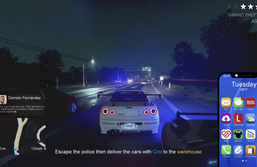
The GTA 6 HUD design will likely feature a minimalist approach with contextual elements appearing only when needed, prioritizing immersive gameplay and a cleaner screen.
The anticipation for Grand Theft Auto VI is huge, and one area that’s got fans buzzing is the potential design of the in-game interface. Speculation runs wild about how Rockstar Games will present essential information to players. We all wonder about the look and feel of the GTA 6 HUD design.
Will it be similar to previous games or will they attempt something radically different? A new approach could greatly impact our connection with the world. Players want a visual experience that enhances gameplay without being intrusive.

GTA 6 Hud Design: A Deep Dive
Okay, everyone, let’s talk about something super cool – the Heads-Up Display, or HUD, in video games. We see it in almost every game, showing us our health, ammo, maps, and all sorts of other important stuff. And when we talk about video games, we can’t forget about the GTA series, right? Well, today we’re focusing on what we might see for the HUD in the much anticipated, GTA 6. It’s not just a bunch of numbers and icons; it’s a big part of how we play and feel immersed in the game world. Let’s explore what makes a good HUD, what we’ve seen in past GTA games, and what Rockstar Games could do to make the GTA 6 HUD the best it can be.
What Makes a Great Game HUD?
Before we zoom in on GTA specifically, let’s chat about what generally makes for a super awesome HUD. Think about a time when a HUD was clunky, confusing, or took up too much of the screen. Not fun, right? A great HUD needs to be informative but also not be a distraction. It should be easy to read, not too flashy, and give you the information you need at just the right time. The main goals are to ensure you know exactly what’s going on without taking your eyes off the action. Let’s break down some key things that make a HUD successful:
- Clarity: The information on screen should be easy to read and understand. This includes using clear fonts and icons, ensuring everything is large enough to see without squinting, and using colors that aren’t hard to see against the background of the game.
- Relevance: The HUD should only show what’s necessary at any given time. When you’re driving, you need speed and a mini-map. When you are in a firefight, you want to see health and ammo counts, but the rest isn’t necessarily useful. The best HUD is adaptable to situations, not cluttered.
- Positioning: Where things appear on the screen matters a lot. Typically, important elements like health bars and mini-maps are put at the edge of the screen, often in the corners. This keeps them visible without covering up too much of the action.
- Customization: Lots of games now allow us to change HUD elements. This can be as simple as turning some features on and off or scaling the size of elements to fully customizing the screen. Giving players these choices is really a good thing, so everyone can make the HUD that feels best for them.
- Immersiveness: The HUD should feel like it is part of the world instead of just floating on the screen. A lot of games are trying new ways of making the hud seem part of the actual game so it doesn’t break you from the world it has created.
GTA’s HUD History: A Look Back
Now, let’s look at how GTA has handled HUD design in the past. Each game in the series has tweaked things a little differently, learning from what worked and what didn’t. Let’s see the general evolution of it:
The Classic GTA Style
The early GTA games, like GTA III and Vice City, had HUDs that were pretty basic. They were functional, showing you your health, wanted level, and the weapon you had equipped. The mini-map was a simple square in the corner. They got the job done, but they were not fancy at all. It worked great for that time though and matched the game’s simple charm.
San Andreas and the Refined HUD
GTA San Andreas brought in some changes. The HUD was still simple but added new meters for stuff like stamina and muscle. It also brought in the new feature of the weapon wheel which was one of the bigger changes for the hud. San Andreas started to become more of an RPG, so the UI elements needed to become more comprehensive. Even though it was much better than the previous games in the series, it was still fairly basic.
GTA IV’s More Realistic Approach
GTA IV made a big leap in terms of graphics and realism, and its HUD followed suit. The HUD was still minimal, but it felt more modern. It had a round health bar around the mini-map, and the weapons were displayed clearly. It was a bit more polished than the older games, and it fit with the game’s more serious tone.
GTA V and the Current Style
GTA V, and even GTA Online, brought us the HUD we are all most familiar with now. It was clean, simple, and gave us all the essential info without any problems. The mini-map is there, the health and armor are easy to see, and switching weapons is smooth with the updated weapon wheel. This HUD is the most developed one in the series and is a great example of a functional and user-friendly design. It was also very flexible, able to show information based on the current situation. This could be adding the mechanic and other needed icons or changing when the player is driving or shooting.
As we can see, the HUD in GTA has changed a lot since the first games. Each game has added something new while keeping the core of the hud the same. Rockstar has always tried to improve each game with a better UI and hud design, and the games have benefited from the changes each time.
What Could GTA 6’s HUD Look Like?
Alright, here’s where the fun begins! We are in unknown territory, but we can make some educated guesses about the future. What could Rockstar do with the HUD in GTA 6? Let’s brainstorm some ideas:
A More Immersive Experience
One big trend in modern games is making the HUD feel like it’s part of the world instead of just sitting on top of it. Imagine a world where instead of icons, the game has more diegetic interfaces. This is like health meters displayed on a watch, or vehicle information shown through a car’s dashboard display. This creates a feeling of immersion and would make the game feel much more realistic. Games like “Dead Space” and “Cyberpunk 2077” have already been successful with this kind of design.
Rockstar could take a similar approach, hiding HUD elements within the environment or giving them some sort of in world reason to be there. This would result in a more natural and realistic feeling hud that didn’t feel separate from the world. It makes players feel more engaged in the actual world that they are playing in.
Dynamic HUD Elements
The HUD should change based on what you’re doing. Like in GTA V, the HUD could change and show different elements based on the current situation, but what if they could go further? If you’re in a car, the HUD displays speedometer, fuel level, and the mini map. If you are on foot in a shootout, the screen changes to show health, armor, and ammo counts. They could use this idea for much more though, like if you’re in a stealth section or talking to people. It could really help with immersion by only showing the needed elements.
Advanced Mini-Map Features
Mini-maps are a standard part of GTA games, but there’s always room to grow. A more advanced mini-map could show different types of areas or locations, like gang territories, points of interest, and even police patrols in real time. It could also be interactive, allowing you to set waypoints easier. It is very likely that Rockstar has plans to implement this, especially considering how much they have improved the previous systems in each release.
Highly Customizable Options
Customization is key. Players should have a ton of options for the HUD in GTA 6. We should be able to turn elements on and off, move them, change their size, and pick the colors we want. This would help people make the hud that works best for them, especially if the core hud design isn’t to their liking. More customization will improve the game and make it enjoyable for more people.
Accessibility in Mind
It’s important to talk about accessibility too. Rockstar should design a HUD that’s easy for everyone to use, regardless of any visual impairments. This means options for larger fonts, high contrast colors, and ways to make the hud more friendly. Everyone should have an equal and great experience playing the game.
Rockstar has been good about adding accessibility options in the past, but there is always more to do in this area. The more options there are for people to use, the more people will enjoy the game. Accessibility options will continue to improve as games become more widely available.
Potential Problems and Solutions
Of course, even with the best intentions, there could be some challenges when designing the GTA 6 HUD. Here are some things to keep in mind:
Clutter and Overload
If there are too many elements on the screen, it could be overwhelming and distracting. The solution is to keep things minimal, only showing the necessary info at any time. Making it adaptive to the game state would be the best way to avoid any issues here.
Readability Issues
Small text, thin fonts, and colors that blend into the environment can make the HUD hard to read, especially for people with vision issues. Rockstar will need to make sure their choices are easy to read for everyone who plays the game. Accessibility options will help here, but the core design should be easy to see first.
Balancing Immersion and Function
If the HUD is too “realistic,” it might not be helpful to gameplay. There is a fine line to balance here, since the hud needs to be immersive and give people the info they need. It’s going to be a challenge, but a good way is to be able to toggle the more immersive elements on and off for different players. This way, everyone can enjoy the game how they wish.
Speculations and Fan Theories
It wouldn’t be a GTA game without a little speculation! Fans on forums and social media have lots of ideas for the GTA 6 HUD. Some want a totally customizable HUD with widgets, others want a fully diegetic interface, and some fans want a mix of both. Some have even made their own mockup designs, showcasing their ideas. Rockstar will hopefully listen to the community feedback to make something great.
Mockups and Fan Designs
Fans have created many mockups of what the hud could look like, most showcasing a very sleek and modern design. Many fans seem to be very into the idea of a fully customizable hud with widgets. Some also prefer to have a design that is very much like GTA 5, but more improved and streamlined.
It is fun to speculate on these designs, but ultimately Rockstar will have their own ideas. Most people are just happy to see new improvements to the games they already love and enjoy.
What Rockstar May Be Working On
Of course, we don’t know exactly what Rockstar is planning, and they aren’t telling us either! They are the biggest secret holders in the gaming industry! What we can guess from their past games is that they will likely use a modern design for the hud but also add more in-depth gameplay elements. From what we’ve seen in other modern games, diegetic huds are becoming more of the norm, but maybe Rockstar will want to keep a more traditional design. Only time will tell for sure.
The HUD is such an important part of any game, and the design of it should not be ignored. The quality of the hud can really make or break the feeling of the game and can even make it more or less accessible. Rockstar games are well known for their excellent design so we can only expect the hud in GTA 6 to be nothing less than great.
The HUD in GTA 6 will be more than just numbers and icons; it will be an essential part of how we interact with the game world. Rockstar has the chance to make something amazing, something that feels natural, helpful, and immersive. If they blend the lessons from past GTA games with innovative new ideas, they can create a HUD that enhances the gameplay and keeps us all totally hooked.
GTA VI Reimagined: New HUD Bars and Core System
Final Thoughts
In summary, anticipation surrounds GTA 6’s HUD. We expect a modern and functional interface. Minimalist designs often enhance gameplay.
The developers likely aim for clarity. They will balance vital information display and visual appeal. Many are excited to see the new GTA 6 HUD Design.
Overall, the HUD must feel intuitive. It should not distract players from the action. Players eagerly await its reveal.

